
13 December 2011
Block Layout of a newspaper
 |
| This is a block layout of my front page. |
 |
| This is a block layout of my page 2. |
Taken and Chosen Photos

 |
| I have chosen this images but it needs editing. |
 |
| I chose this image as it shows a clear veiw of the front of the hopistal, however it does need editing. |

 |
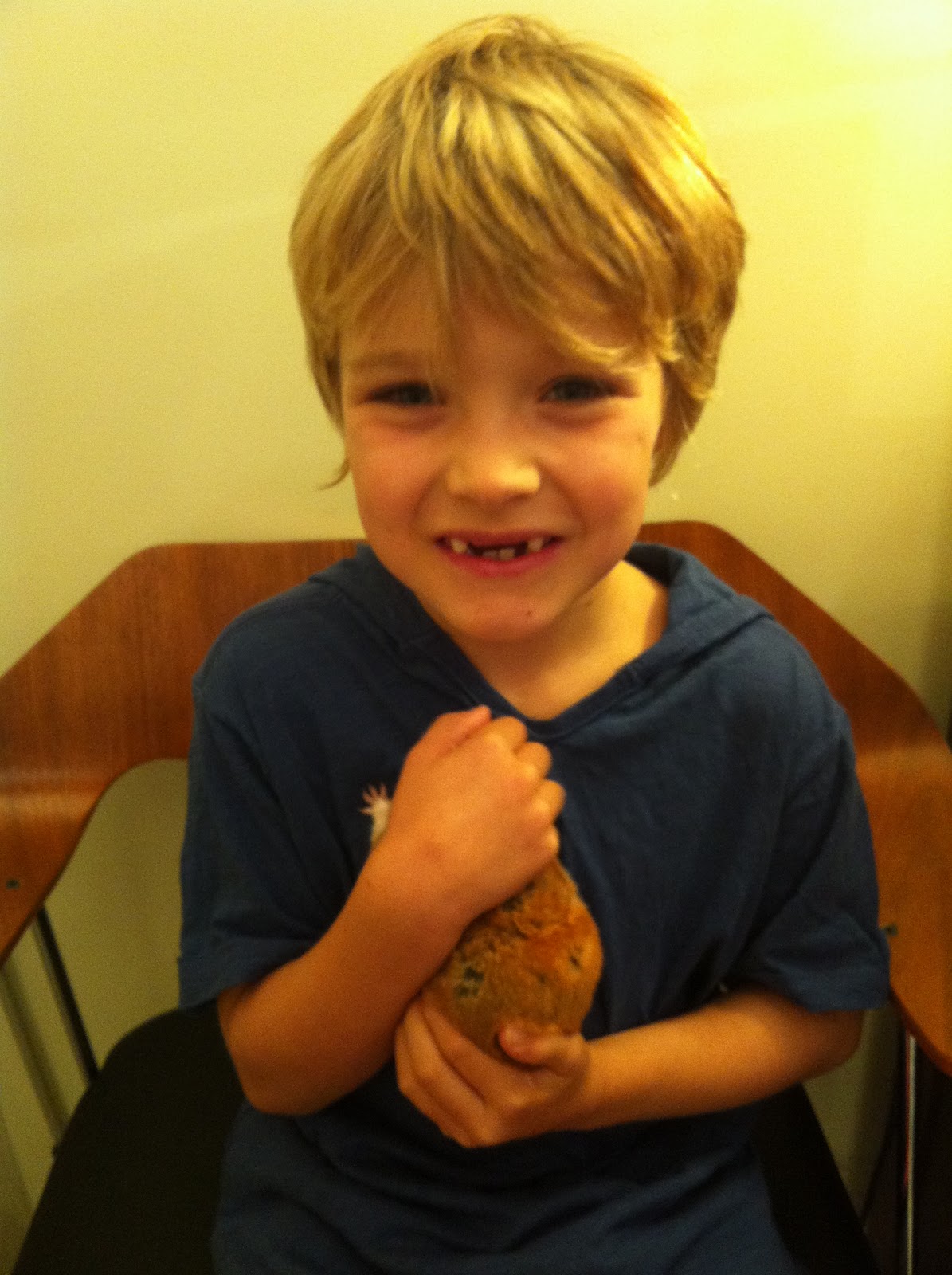
| I chose this image as all the children are looking at the camera and are caught in action. |


 |
| I chose this image to edit as all the people look happy but the images needs lightening. |


 |
| I chose this image as the lighting isn't as bright as in the other ones. |
 |
| I chose this image as it has a nice view of the car. |


 |
| I chose this image as the horserider is caught in action. |
Newspaper Paper Names - Annotaion/font/colour
Potential Newspaper Names
Harrogate Post
Harrogate Herald –I have chosen Harrogate Herald as it clearly explains the area the paper is aimed at. Herald is a traditional established name, which suggests the paper is reliable. Herald also implies that the newspaper will announce up to date news about Harrogate. Harrogate Herald also has alliteration.
Harrogate Gazette
Harrogate Voice
Harrogate Express
Harrogate Chronicle
Harrogate Messenger
Potential Statements.
Voice of the community since 1832.
Up to date news of the town and surrounding areas.
Established in 1832.
Voice of the town and surrounding areas since 1932. – I have chosen this one for my statement as it explains that it is aimed at not just Harrogate but also its surrounding areas.
Fonts
Harrogate Herald
Harrogate Herald
Harrogate Herald
Harrogate Herald
Harrogate Herald - I have chosen to put Harrogate in a bold and clear so it states simply who the paper is aimed at. Herald is in a more traditional font as it shows that the paper is reliable and well established.
Voice of the town and surrounding areas since 1932. -
Voice of the town and surrounding areas since 1932.
Voice of the town and surrounding areas since 1932.
Paper names

Photo Manipulation
 |
| This was my orginal image. |
 |
| I edited the photo on photoshop. |
 |
| This is my advert with my image on, I made it on InDesign |
Final Feedback on all my Products
Newspaper - Front and Page 2
Positive
- Authentic
- Clearly all ultra-local stories
- Informative and what you want to know
- Good news values
- Interesting images
Negative
- The adverts do not appeal to all
Website
Positive
- Realistic and professional
- Good range of stories
- Simplistic and easy to use for all ages
- Like how the images break up the page
- Connects well with paper
Negative
- Could have used more colour
- More movement on page
Advert
Positive
- Good concept
- Gets point across
- Eye catching
- Relates to the newspaper and website
Negative
- Could have used more interesting fonts
12 December 2011
Audience feedback on my advert
Audience feedback - 20th October 2011
Audience Feedback - 9th November 2011
Positives
- Nice concept
- Good images and ideas
- Lots of blank space
- Too many images (too much to look at at a glance)
Audience Feedback - 9th November 2011
Positives
- Good use of images.
- Concept very unique and protrayed well.
Negatives
- Lots of blank space.
- Exerpment with font sizes and colours.
- Images dont stand out.
- Green text doesnt stand out from green background
Audience feedback - 29th November 2011
Positives
- Good layout.
- Point gets put across
Negatives
- Does not make it clear that the paper is weekly
- Spelling
Subscribe to:
Comments (Atom)